12/30/11 05:45 PM
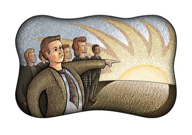
Thanks to everyone who voted for my best illustration of 2011. The response was greater than I anticipated and there was a clear winner with "Finding Hope in an Uncertain Economy" getting nearly half the votes (
"Winter" was the runner-up). I agree that this was probably my strongest concept from 2011. But when I worked on it last summer, I was in the process of transitioning to doing most of my shading work digitally with a Wacom tablet. At the time I was very concerned with duplicating all the idiosyncracies of my traditional way of shading with oily stick media on a textured physical surface. This piece accomplishes that, but since then my technique has evolved to take more advantage of the unique opportunities that come from working digitally. In many ways, this is closer to the way I've always wanted the work to look but have been hindered by the limitations of the physical textured surface.
So I decided to go back to this piece and add more depth using the new techniques. I've always been a huge fan of
Gary Kelley. I've never met him but he's been a big influence on my work, and I love the shallow "shadowbox" depth he creates in so many of his pastel illustrations. The new methods I'm using enable me to more effectively manipulate depth in a similar way. I also increased the saturation on the "hope" building to make it pop out more, and I made the textures overall a bit more subtle. What do you think of the changes? (you can see the original version
here)
Thanks again to everyone who voted, I'll be entering this piece in the Communication Arts Annual Illustration Competition as promised. Wish me luck!
Subscribe by  RSS feed or email feed to keep up with my new projects!
Tags: Finished Illustration
11/17/11 10:23 PM
Finished up the "Summer" Piece. I'm really happy with this one. It was more of a challenge than I was anticipating. I had to try to maintain a certain level of visual consistency while illustrating a season that could be described as the opposite of the first one. So among other things I had to reinterpret the stark but vibrant palette from the
"Winter" into something more lush and warm. (You can see the two pieces together
here) I think it is pretty successful, can't wait to get started on the other two.

Subscribe by RSS feed or email feed to keep up with my new projects!
Tags: childrens, Finished Illustration, Unpublished, Stock
08/28/11 09:30 PM
For a while now I've wanted to participate in
Illustration Friday. Each week, a new topic is announced and anyone can submit an illustration on that theme. This past Friday's theme was "Disguise", with a further quote from Margaret Atwood: "Another belief of mine; that everyone else my age is an adult, whereas I am merely in disguise."

(Click to enlarge)
I went for a somewhat straightforward take on the quote, hoping that the absurdity of a literal interpretation would carry it. I also wanted to contrast the relaxed, confident pose of the clothing shell with a scared, overwhelmed expression. I envisioned it a little moodier, bordering on creepy, but my somewhat cartoonish drawing style works against that. Not sure how successful this one is, what do you think?
The sketch:
Subscribe by RSS feed or email feed to keep up with my new projects!
Tags: Illustration Friday, Finished Illustration, Unpublished
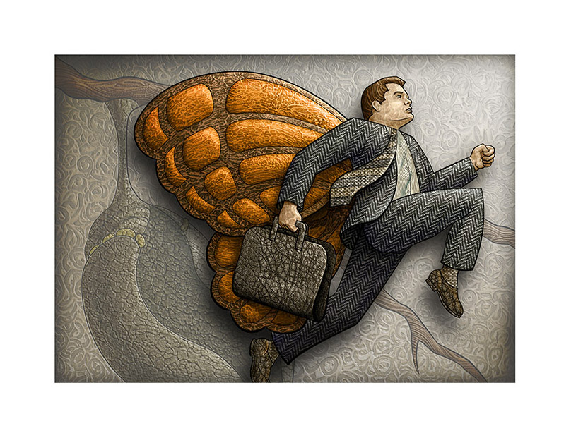
08/17/11 09:45 PM
So here's the SCAD career fair submission, I'm pleased with the way it turned out. As I was working on the piece, the figure seemed to be strong enough to carry the illustration on it's own, so I began to think about ways to emphasize it and make the background/chrysalis less of a focal point.
One idea I had was to literally make the background into a flat backdrop as if the figure were an actor on a stage. To me this plays up the humorous juxtaposition of the heroic pose with the butterfly wings. In addition it works conceptually as SCAD now has several well-respected major programs in performing arts. So I really tried to push the "actor with theatrical lighting in front of a flat backdrop"/shadowbox look.
And before any of my friends makes fun of my age yes, I know professional artists don't schlep old-school portfolios like this around anymore, I'm using it as a symbol, dangit!
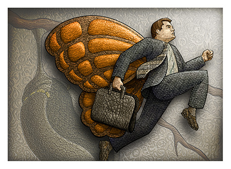
(Click to enlarge)
Subscribe by RSS feed or email feed to keep up with my new projects!
Tags: Finished Illustration
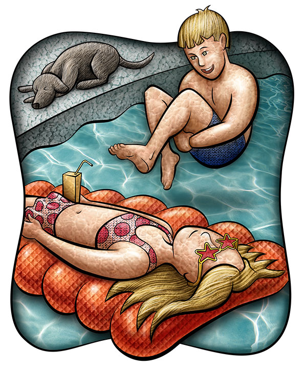
08/08/11 09:42 PM
Very happy with this one. I went for a brighter palette and more chromatic shading than I usually work with to give it a more fun, juvenile look. I like the results, I may even experiment with more hi-chroma shading in my "adult" work.

Subscribe by RSS feed
or email feed to keep up with my new projects!
Tags: childrens, Finished Illustration, Unpublished
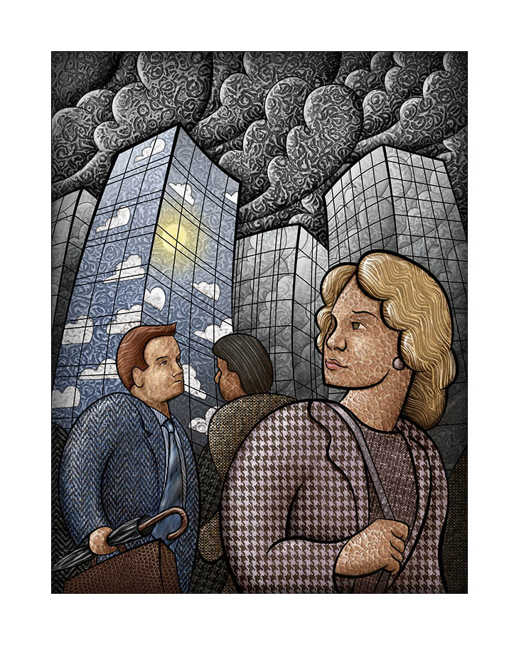
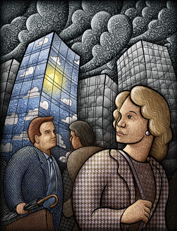
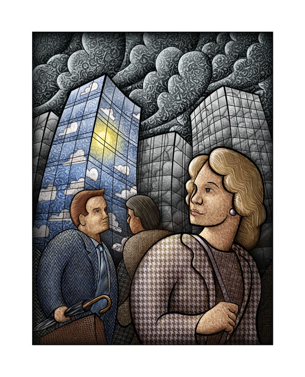
07/17/11 12:40 PM
I Finished the new illustration and I'm really happy with it. My biggest challenge was balancing the layers of cloud textures, cloud line work, etc. in the building reflections. In the end I had to sacrifice the textural work and reduce the opacity of the cloud line work to get it to read as reflections on mirrored glass. What do you think, did I hit the right balance?
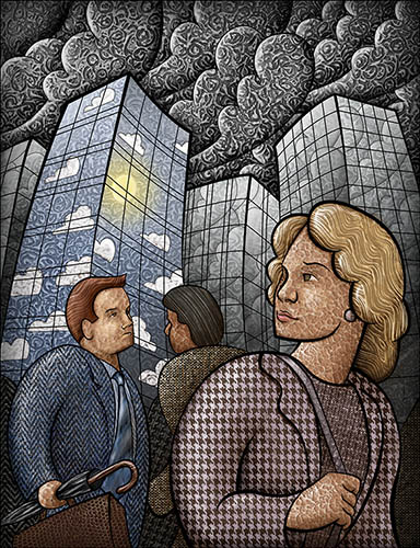
(Click to enlarge)
Subscribe by RSS feed or email feed to keep up with my new projects!
Tags: Finished Illustration, Unpublished, Stock
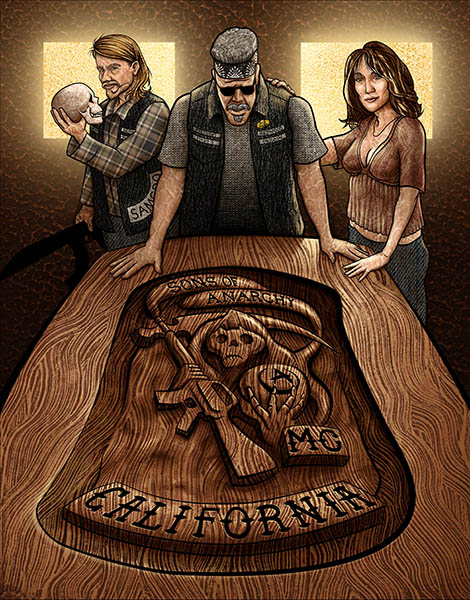
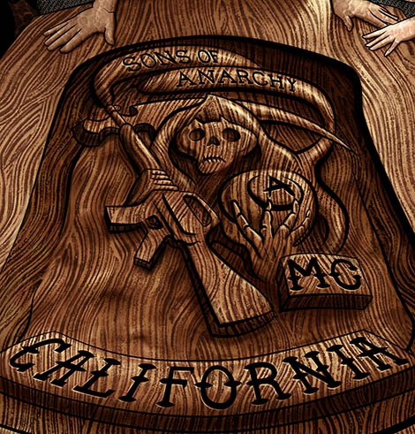
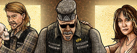
07/06/11 10:39 PM
Finished the Sons of Anarchy piece. Overall I'm happy with it. As a technical exercise I succeeded in pushing the level of detail too far- but this has helped me immensely in finding the point at which things break down within my style and more is simply more. I hope to incorporate some of the lessons I've learned here in the direction I take moving forward.

(Click to enlarge)
I included some detail images, these still are less than half the resolution of the original:
Subscribe by RSS feed or email feed to keep up with my new projects!
Tags: Detail, Stock, Finished Illustration, Unpublished
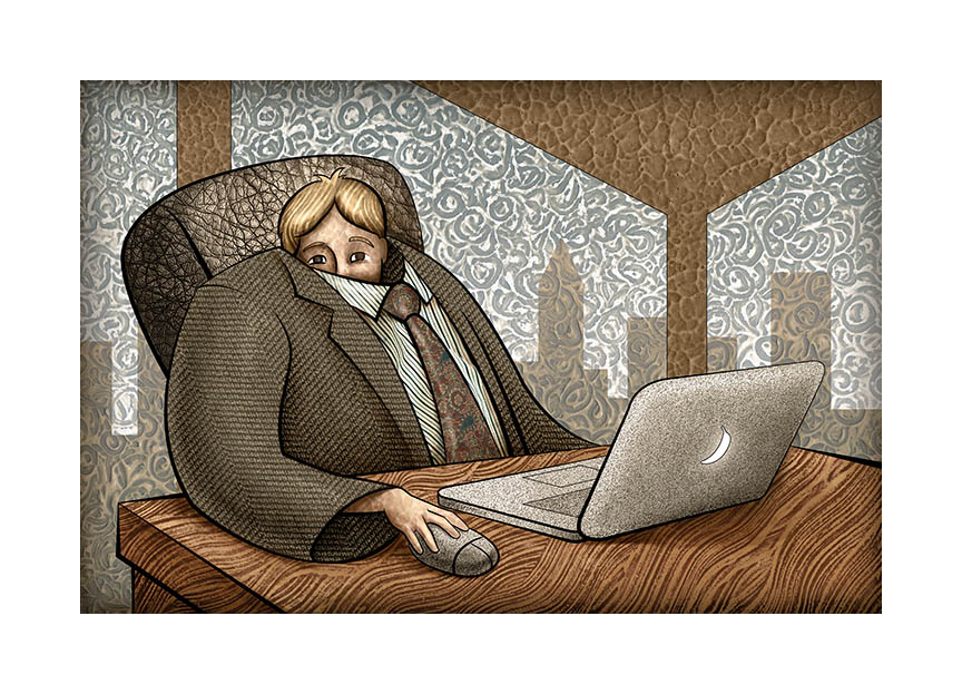
05/28/11 10:03 PM
Finished the stock piece. Overall pretty happy with it.
(Click to enlarge)
Subscribe by RSS feed or email feed to keep up with my new projects!
Tags: Stock, Finished Illustration
05/18/11 09:38 PM
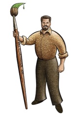
(Click to enlarge)
Finished the self portrait. I'm happy with the way it came out, but as a home page image... not so much. With all the elements together it just didn't fit with the concept of the site. I'm sure I'll find some use for it. Ideas?
Tags: Self Promo, Finished Illustration